Card
A card is used to visually group parts of text or images that normally require action. Cards can differ in content and appearance, but all are characterized by the short length of the content and their targeted spelling.
Why using a card?
Cards are a great way to describe entities (i.e. topics including people, places or things) in a short way. Providing long information over voice can increases cognitive stress as the user has to remember long information by himself.
Guidance
Usually a card can describe a single topic with a short text, an image and an action link. The latter can be used to access further details outside of the voice interface environment. As a result of their compactness, cards must have a fixed height and width. Content that exceed the maximum height or width is truncated and does not scroll.
Interactivity
- Tap: opens further information in an external service, i.e. in a web browser.
Structure of a card
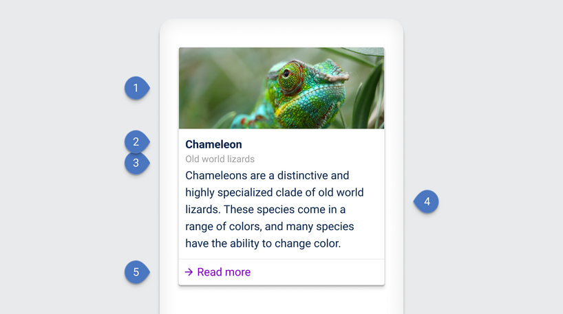
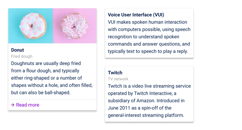
There are many alternatives for designing a card. The following structure example shows a card with five components. There is no fixed rule, such as how many components should or should be used. As long as there is no interaction within the card itself (i.e. scrolling or expanding the card to full screen mode). The only exception is the action link.

| Components |
|---|
| 1 Image |
| 2 Title |
| 3 Supporting title |
| 4 Description |
| 5 Action link |
Examples
