List
A list is very simple and its purpose is designed for high readability and quick scanability. With as few elements as possible, the user should be shown all important information. Based on the information displayed, the user should can select a desired list item with a tap or voice interaction.
Why using a list?
A list guides the user to content that is interesting to him or her. The main feature of a list style is the ability of the user to quickly scan multiple items at the same time.
Guidance
Lists with a lot of elements can be scrolled. There is no maximum of items that can be displayed in a list. However, it is recommended that the user see a list that is not too long as the speed of scanability may be affected.
Interactivity
- Tap: opens further information in an external service, i.e. web browser.
- Scroll: scrolls through the list to reveal items.
- Voice: selects and opens an item in the list with voice.
Structure of a list
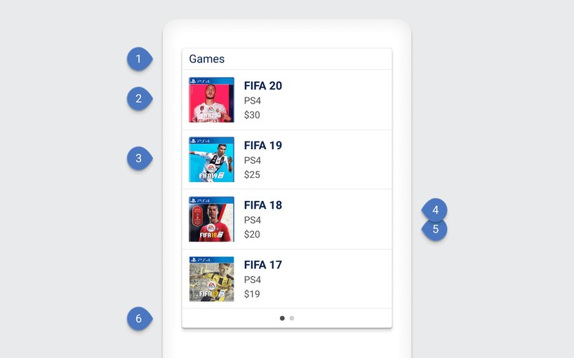
List elements are nested in a scrollable container. The container is marked with a list title, which should be an overall category for the list elements. The list element is structured with a primary and secondary text, it is possible to add a supporting picture to the list to allow the user to scan the list faster. The content of a list element must not be overloaded and only contains the most important keywords.

| Components |
|---|
| 1 List title |
| 2 List item |
| 3 Image |
| 4 Primary text |
| 5 Secondary text |
| 6 Page indicator (Bullets) |
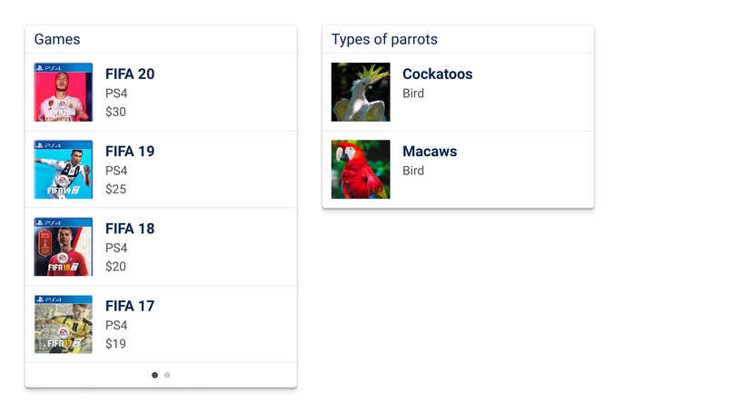
Examples
