Table
Tables are a design pattern for displaying tabular data for easy readability and scanability. Tables are “viewing only” and cannot be interacted with, unless there is an action link within the table.
Why using a table?
Use this pattern to show users an amount of data in columns and rows without affecting the readability and scanability for the user.
Guidance
Prioritize the most relevant information in the top columns and rows. Less is more, so aim for as few columns and rows as possible, depending on the screen size. In addition to the titles and headings, the table should not require any further explanations. Make sure that the classic overloaded spreadsheet look of a table is avoided and that the data is clean and easy to access.
The goal should be to provide quick information to the user – if further interaction is required, it is better to use the design pattern List.
Interactivity
- Tap: the normal behaviour has no interaction – it only presents data to the user. Is a an action link available, a tap opens further information, i.e. in an external service such as a web browser or it continues the conversation with new voice output form the VUI.
Structure of a table
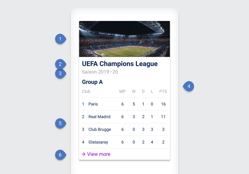
A table should have a title and if necessary an optional subtitle so the user can better understand what he or she is looking at. A column heading is required to clearly and precisely identify the content so that no further explanations are required. Optionally, the table can be provided with a picture near the title for visual support. An optional action link can also be helpful to continue the dialog or open more information in a web browser.

| Components |
|---|
| 1 Image (optional) |
| 2 Title |
| 3 Subtitle |
| 4 Column heading |
| 5 Row content |
| 6 Action link (optional) |
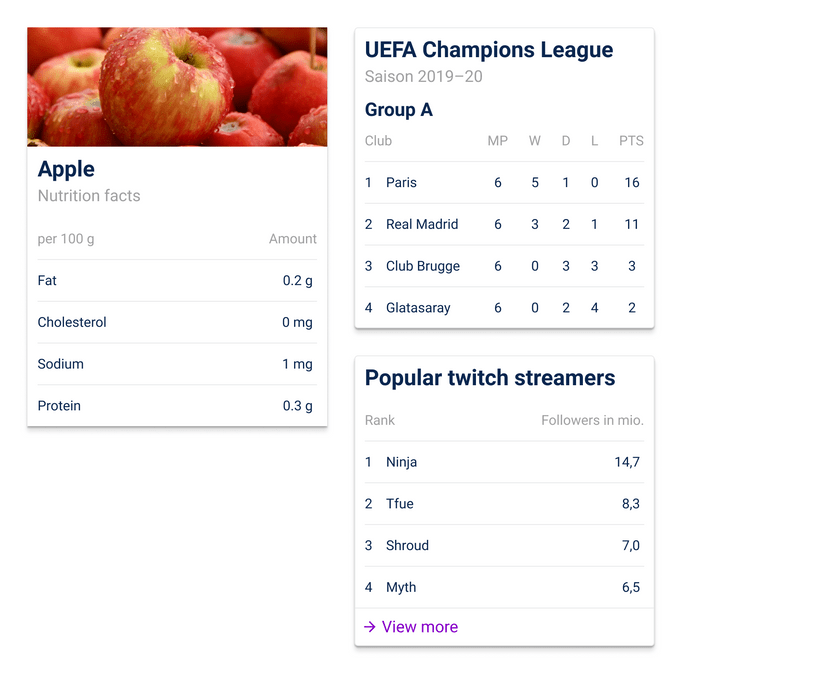
Examples
